24 Wedding Website Examples: Themes and Designs
Need some wedding website inspiration? We’ve compiled a list of our favorite wedding website templates. Read more here.

Now that we’ve walked you through what information to include when you build a wedding website and why you need one for your wedding, here comes the fun part: figuring out a beautiful wedding website theme and design.
We stand by our previous advice of having your website complement the style of your actual wedding theme—whether it’s modern chic or bohemian. A great way to translate that online is by being selective about the color schemes, images, and even typography of your wedding website. Adding a personal touch, such as a story about the happy couple or if there’s a special reason behind the date of your big day, can make this part of wedding planning easier and more fun to do together.
Thankfully, a lot of wedding companies—including Zola—have website builder templates for you to choose from that you can then customize to your liking. Ahead, we list out some of our best wedding website examples (from over 300 Zola examples) that will hopefully help spark some inspiration for your own custom wedding website design.
1.Old School Charm
This is a classic wedding template design with a sophisticated feel. It's great for the traditional couple (hence the monogram) and is perfect for a wedding taking place at a country club or another equally posh wedding ceremony location.
2.Outdoorsy
For the couple that lives for adventures, this is a nice nod to nature. It’s a good option if you’re having an outdoor wedding ceremony or just know that there will be a lot of greenery involved.
3.Romantic Vibes

A deep red color like this one automatically reads romance. Specifically, the kind that takes place in a cabin, next to a fireplace, in the middle of winter. So, if you’re opting for a cold-weather wedding, this could be a good choice.
4.Tropical Getaway
As soon as you see the spiked palms on this website, you immediately know this destination wedding website is going to take place somewhere warm. It’s a big hint for guests without giving away the entire theme.
5.Cute Colorblocking
We love the use of color on this website which, for some reason, reminds us of a quirky startup. It gives off a playful energy that’s bound to make any aesthetic-obsessed millennial happy.
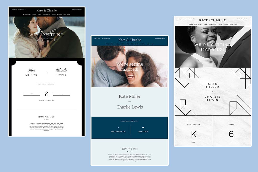
6.Simple and Sweet
Thanks to the script text, this website design is simple and to the point, while still remaining chic. It’s a great choice for an array of wedding types, from beachfront to ballroom.
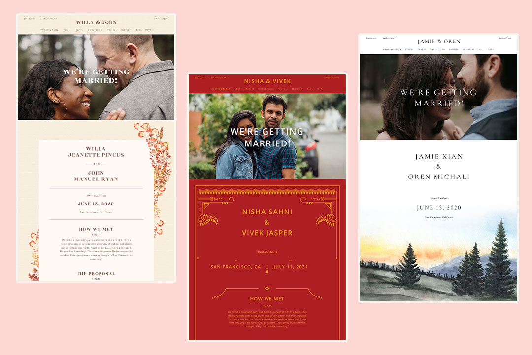
7.Cultural Elements
If you know you’re having a ceremony and reception that follows the traditions of your culture, it’s a nice idea to incorporate those wedding details into your website. This bold and bright website uses Indian motifs and is a preview of what’s sure to be an equally bold and bright wedding.
8.Architecturally Approved
This website manages to be both fun and grownup at the same time. The architectural lines and shapes with the abundance of white, marbled space pairs well with black and white photography.
9.Minimalistic
Sometimes all you need is a minimalistic, to-the-point website. If you don’t want to spend more time making any other style decisions, go for this simple text and type layout. The wedding day is where the real effort should be directed anyway.
10.Big Typography Fans
For the couple for whom typography is king, we present the graphic designer-approved layout. The color combination gives off Nashville or Austin vibes that are retro and contemporary all at the same time.
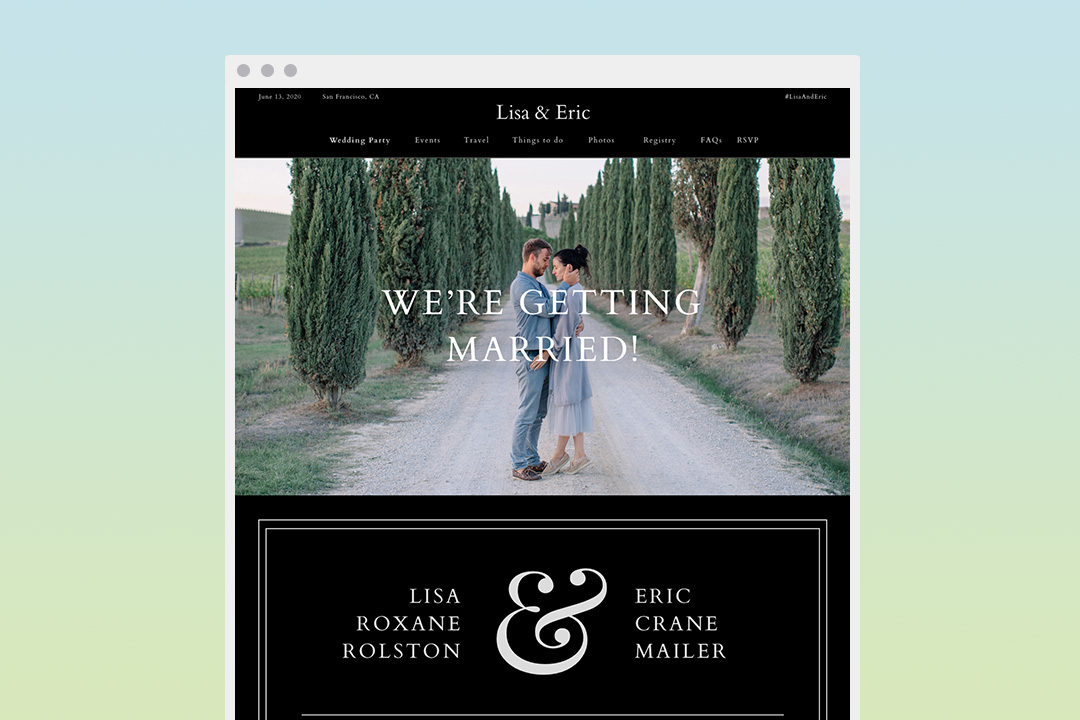
11.Starry Starry Night
Black is a bold, unexpected choice for a website that gives off an air of Great Gatsby-like glamor. It’s also perfect for a wedding that’s taking place outside and under the night stars.
12.Trendy and Bright
This website reminds us of a playful, trendy restaurant—in the best way possible. The bold colors are stunning and the traditional Mexican motifs add a hint of folklore.
13.Wanderlust Lovers
We’re obsessed with this sweet, muted green and nude combination. The “you’re invited” sticker is reminiscent of a passport stamp, which makes us think it would be perfect for a destination wedding. Or, it can simply be a nod to the couple’s love of traveling.
14.City Setting
Make clear where your guests will be partying (and perhaps where the couple also met) straight from the get-go by including an outline of the skyline. In this case, it’s pretty obviously New York City.
15.Gingham Style
Perfect for a backyard or barn wedding, this gingham print makes known what kind of environment guests can expect. Think preppy and sweet.
16.That Fall Feeling
Another great option for a winter or fall wedding, thanks to its deep, warm hues.
17.Beach Babes
This website is nautical and beachy without being too obvious. It’s ideal for a wedding taking place alongside the water.
18.Vintage Perfection
This wedding website template has plenty of vintage style and charm reminiscent of a western ranch—perfect for a rustic wedding.

19. Desert Boho
For any desert-loving couple, this beautiful watercolor cacti design is simple but elegant. It’s great for a wedding taking place in warmer months.
20. Southern Elegance
With a hint of floral and a soft color palette, this wedding template is fitting for anyone planning a charming southern wedding.
21. Adventurers
This wedding design features deep, earthly colors, with a beautiful forest of trees, perfect for the adventurous couple. This may be a great option for an outdoor wedding.
22. Mickey and Minnie
If you’re a Disney fan, you’ll love Zola’s Disney-themed designs like this one. It features Mickey and Minnie, a great option for any Disney lover.
23. Summertime Sunflowers
For the couple getting married in summer, surrounded by sunshine and happy vibes, this template radiates joy.
24. Twinkling Lights
Sparkly string lights set the mood with this cute and fun design.
What to Include on a Wedding Website?
After browsing some of our beautiful wedding website examples, now it’s time to design your own website. Feel free to customize your website with one of these wedding website templates, but keep some of these must-have features in mind to make sure your website is informative for your guests.
-
Header. Your header can be as simple as your names at the top of your website—or, if you want to give a little more information, use it to greet your guests and explain what they’ll find on your wedding website.
-
URL: Custom Domain. Choose a domain name that is simple and easy to remember. Consider using your first names (for example, TommyAndGina.com), include your wedding year (GrangerWedding2023.com), or a cute play-on-words to make your wedding URL unique to you (FinallyFreedmans.com).
-
Share Your Love Story. Your love story is unique to you. Your wedding website is the perfect opportunity to reflect on your first date or the moment you both fell in love with each other.
-
RSVP. Make sure the RSVP date is clearly stated on your website so no one misses out on celebrating your special day with you.
-
Event Details. You’ll also want to include any relevant event details (more on those in a bit).
-
Dress Code. Specify the type of dress code so your guests know what to show up in. Is your wedding black tie—or is it more smart casual?
-
Wedding Party. Take a moment to introduce your wedding party and why you’ve asked those closest to you to share in your big day.
-
Wedding Date. No one wants to get your wedding date mixed up. Make sure the date is clearly stated on both your wedding invitations and your website. If you have international guests joining you, be sure to write out the month and date to prevent any confusion on when you’re hosting your big day.
-
Wedding Venue. Provide the address of your wedding venue along with driving directions (and a map). You can also include how early guests may arrive at the venue and any other information they might need to know about the venue (for example, if they’ll need to catch a shuttle from the parking lot to the ceremony location).
-
Countdown. Get people excited about your wedding by including a digital countdown tracker on your website.
-
Gift Registry/Wedding Registry. Integrate your wedding registry on your website to give your guests easy access. (Good news! You can create your registry through Zola to make the setup simple and easy.)
-
Social Media Hashtags. Create your signature social media hashtag so everyone can look back and find photos from your engagement party, rehearsal dinner, and wedding day events. Make sure they’re simple to remember but unique to your wedding—like HappilyEdwardsAfter2023 or BradAndBridgetSayIDo.
-
Slideshow with Photos of the Couple or Engagement Photos. As another personal touch, consider including a few photos or videos of you and your partner. Add baby photos, pictures from your childhood, and snapshots that create a timeline of your relationship.
-
FAQs—especially for Destination Weddings. An FAQ page is a great place to add any additional information you want your guests to know. This might include travel information (including information on local hotels and hotel blocks, flight options, and car rental contacts), information about your wedding (like if it’s a child-free event), or information about accessibility at your venue.
Zola, Your Best Wedding Website Option
Your wedding website can be a wonderful tool to use while planning your wedding. It provides a one-stop shop for all the necessary details and information that all your guests can access. And if you need help designing a beautiful wedding website, Zola has got you covered! Choose from our wide collection of themes that match your wedding, style, and relationship. Try Zola’s custom wedding website builder today and access all the features you need to create the perfect wedding website.
